IN REVIEW: R.R.H. #1
http://scifipulse.net
November 11, 2015
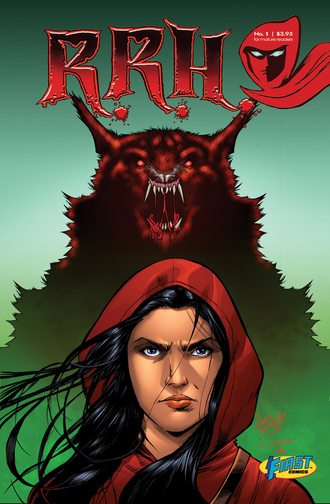
The cover: Sydney Woodman stares strongly at the reader, determined to make her mark on her heritage. If only she looked behind her she might see the gigantic wolf rearing up to strike. There’s a whole lot to like about this cover. The first is the logo. I admit I was wondering what the logo would look like for a character who was the heir to Red Riding Hood; it could be disastrous. I don’t know who designed this, but it looks great. I really like that the first R looks like a character wearing a red hood, and the jagged edges of the letters give it an ominous vibe. It makes the premise instantly cool with only three letters. The illustration features a really strong looking Sydney. She looks like she’s ready to kick some major butt with that intense look on her face, and her windswept hair only makes her look that much cooler. Behind her, just below the logo, is a ferocious looking wolf. I’m a huge fan of werewolf stories and films, so it takes a lot to impress me: Andres Esparza impressed me. The maw stands out, the mottled hair is great, and the coloring is tops. This is the perfect way to introduce this title and this character to readers. Overall grade: A
CLICK HERE TO READ THE FULL ARTICLE
